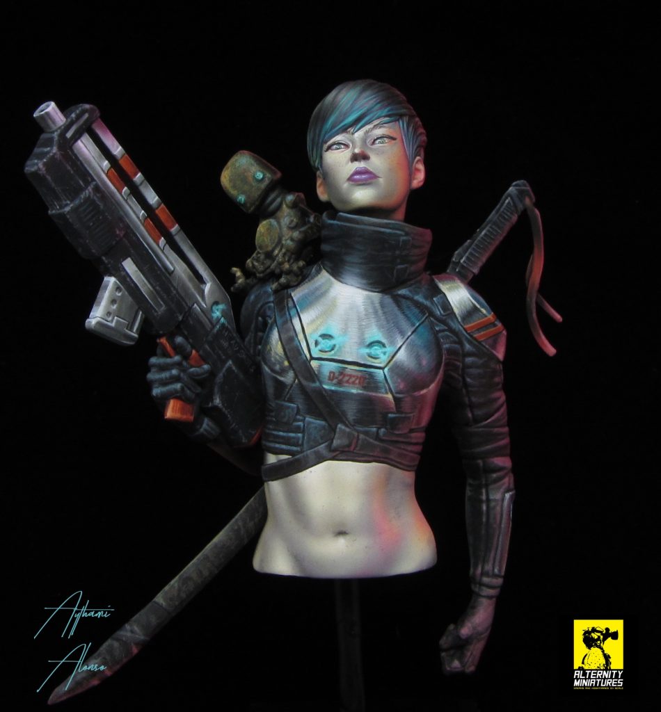
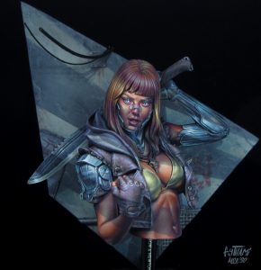
Scultpor: João Paulo Ferreira
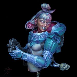
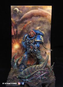
Painter: Aythami Alonso
Concept: Marco Riolo
https://www.alternityminiatures.com
Buy the bust with a 20% discount by writing to info@alternityminiatures and showing the code that I sent. If you don't have it ask for it at orders@notoriginalminis.com. Only the first 10 units!!
Before watching the videos here you have a little article. The real gold is in them.
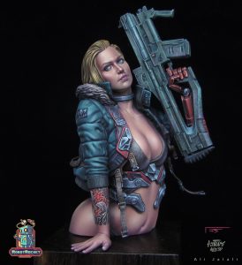
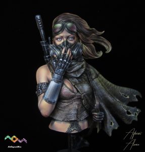
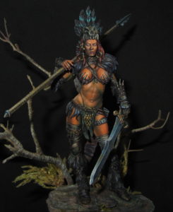
How to paint Dafne's skin
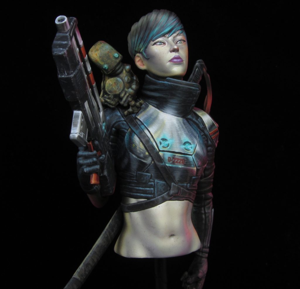
I always start looking for inspiration but this time I wanted to ask something more to myself and let my imagination to lead, so I did not look for anything at the beginning that influenced me.
I wanted the decision-making process to be even more alive if possible, doing what the figure asked me at every moment.
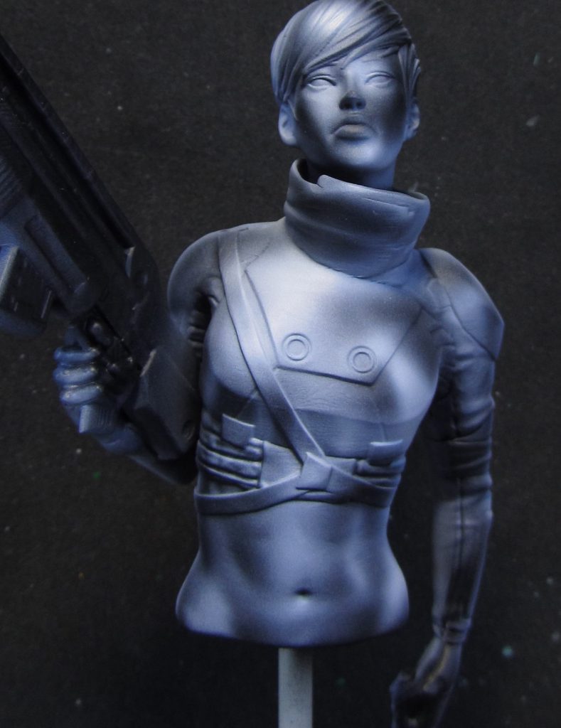
Over a layer of black prime I started playing with two light sources using the excellent White from liquitex. For me. The best white there is for airbrush, barely splits dots.
This process is very important for the final result. We are creating a base and volumetry that, without being immovable, will give us a very approximate image, in black and white, of what we will have at the end.
Imagine that you have 2 seconds to see your finished work. What general feeling provokes you? Can you appreciate an attractive silhouette? With this step we succeed in answering these questions. The "soul" of the bust is established.
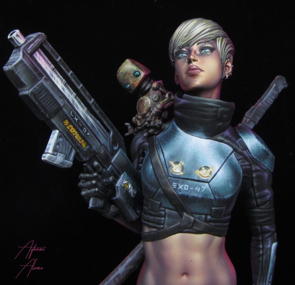
I wanted to continue working with the 2D illustration style that is based on the great illustrators. So with this in mind I play with the airbrush as I was the light. I move the figure to reach the areas that I want. I put two lights:
- One from behind penetrating the right side of the face and belly.
- Another central one throwing it a little to the left (Whenever you put a cenital light, throw it to one of the sides)
To make this "illustration" effect it is important to take into account several factors:
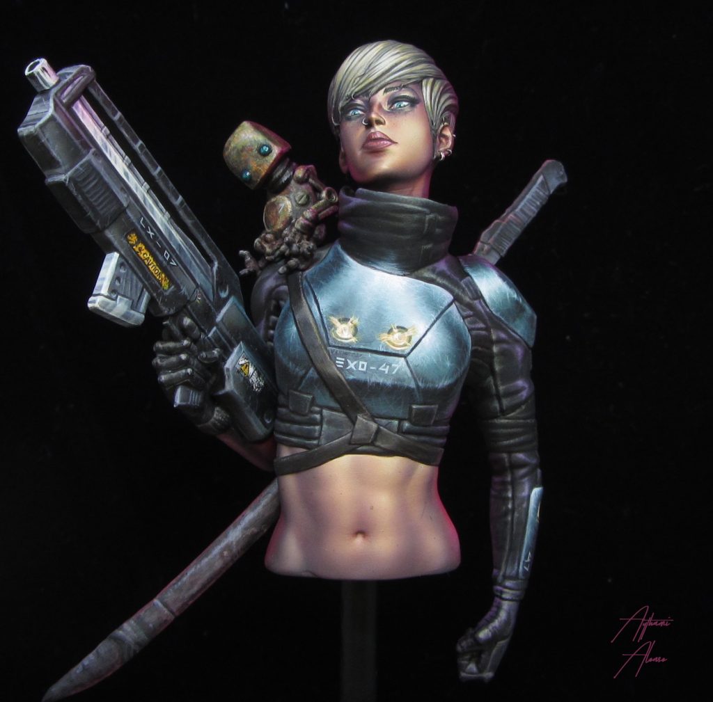
- Choose a main angle where the figure will be 100% appreciated to work with the silhouette of the elements (arms, face, weapon, hair)
- With that angle, start working a volumetry for each silhouette and rebounds of light. Taking into account the angles that we create with the Aero and making a kind of "Aura" around.
- Once the silhouettes are delimited, we close one eye and observe. If we see that some light does not fit with that "Aura" it is necessary to rectify it. Why? When closing an eye we are imitating the effect of a photo. When we take a photo (a single lens) the objects are enlarged and consequently what you thought you were painting and silhouetting, is lost.
- The problem is that by using this illustration effect we give prominence to that angle of vision and not to others.
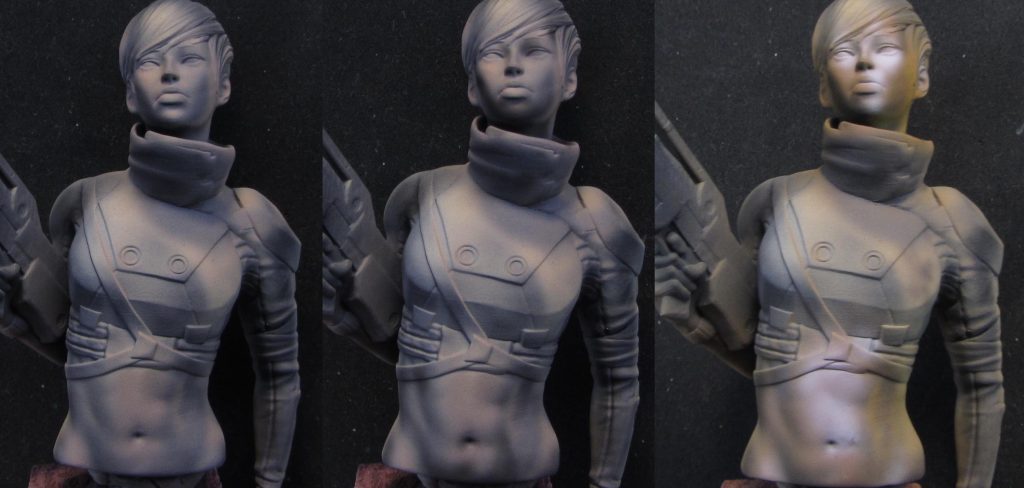
With the lights more or less placed we started to put color.
From here to a few steps forward is pure airbrush testing. Trial and error. I test with oranges, red leather, pinks (1st picture) and started to throw them very diluted in a mixture with Glaze Medium and AK Ultramatt Varnish. Why? The medium is like a transparent color itself, it adds viscosity to the color and removes a lot the splitting dots of the normal colors for the aero. The matt varnish is because it shines a lot when it dries.
The good thing about this transparent mix is that it allows you to see the work below.
Between the color process we put lights and shadows (2nd and 3rd photo). Shadows with black Liquitex and lights with white and brown pink Vallejo. I still did not have clear ideas. But that's fine, because I was wrong 3 or 4 times learning what did not work. All this is in the video so can avoid my mistakes.
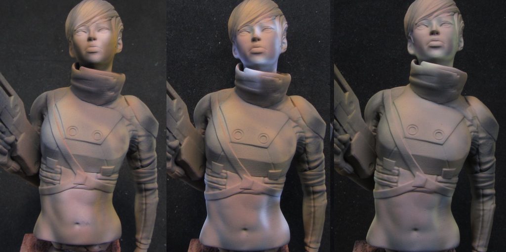
And meanwhile you have a great time trying things. You are closing the fence of the ideas discarding the bad ones and staying with the good ones until you achieve good results. The process is alive.
I keep trying ideas unifying with Red Leather the previous work (1st picture), working that secondary lights with white Liquitex, remember the rules to paint with a 2D illustration effect (2nd picture) and changing the tone later for a warmer one . Little by little I was getting closer to what I wanted.
Tip: Allowing you to make mistakes gives you more freedom when it comes to achieving what you want in the painting. You experience where you did not had to go and especially you stay calm knowing that your idea did not work (or yes!!)
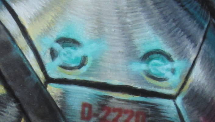
Some ideas like these beams of light end up working.
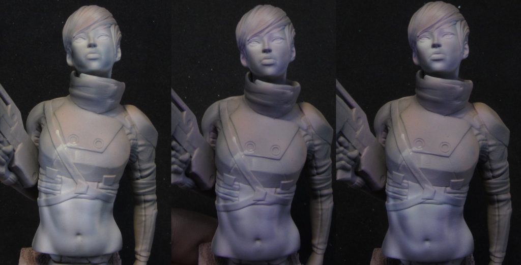
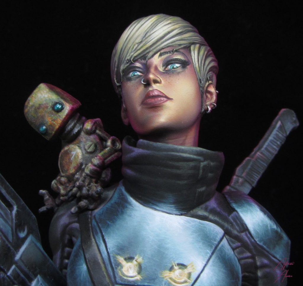
I wanted a pale skin. So I start to throw with the airbrush with very diluted light colors on top of the previous work (1st photo) little by little the tone changes. now is time to watch at reference photos of pale skins of illustrators as good as Ignacio Fernandez Rios I realize that many have a hint of purple in medium tone (2nd picture). And as a complementary color it would be interesting to put in lights a mixture of white and khaki yellow (3rd photo). I explain everything more extensively in the video.
This is interesting because at the beginning of the painting, the exercise was precisely not to copy to train our imagination but to copy, in my personal learning process, it has been and is one of the most important tools to archive strokes, light bounces, previously unrecognizable features, tones , etc.
Together with the technique and the practice they are fed back until you are able to paint without having an example in front, using your imagination and your chaotic memory archive. Transforming all that copies in your own style.
(When I explain how to paint the armor I will tell you the story of how I forgot my own advice, having to repaint the area 4 times, until I put a photo of Kirill in front of me and copy)
But what happens if we just copy? Well, we do not understand the reasons of what happens around us and at the time of transferring it to the figure we are lame. Did you realize that we are affected by the light/color of the ground?
By studying the possible sources of light in our futuristic environment we can imagine that it can be affected by the light of a distant moon of some color, also by the rebound of it on a reddish terrain and this one on the lower parts of the elements, brightly colored fluorescent sources of lights, etc.
We have to demand more of ourselves and play with light. Enter pintarest and look at the illustrations. How many illustrations with only one light source do you see? I do not say that painting with a single light is wrong, moreover, it brings a certain drama depending of the approaches and a naturalness that is sometimes necessary. But by adding more than one we play with the volumes and the environment, and in my case, I demand more from myself.
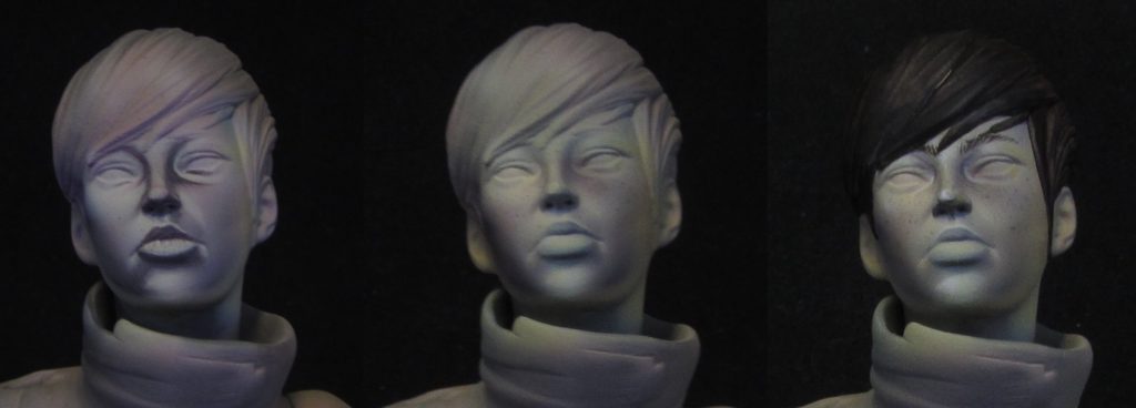
Here we get into detail with the facial features. Although I try to be smooth at the beginning (1st photo) I can not stop being me. At this point there is a lot of anatomy study that we will see in the video. Then I unify with airbrush (2nd photo) to end up taking the brush again giving the last touches in white (3rd photo)
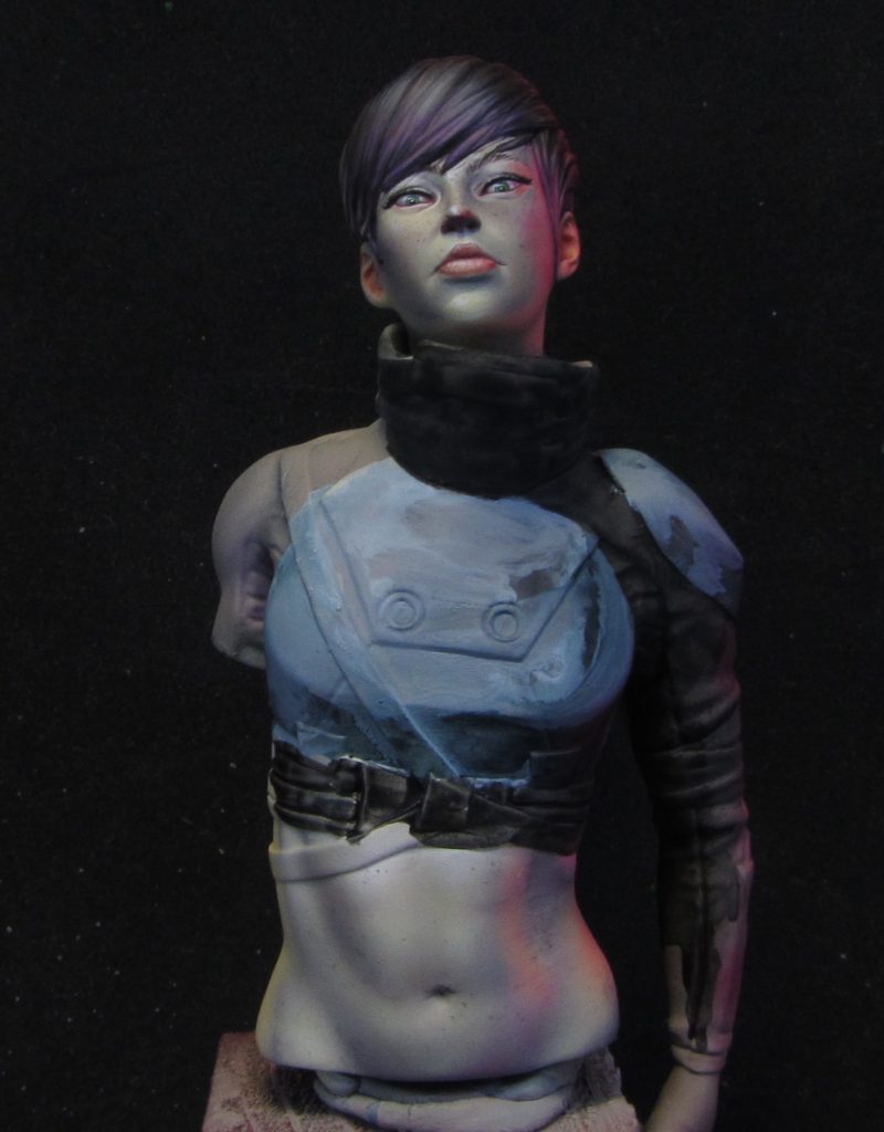
Finally I put a powerful secondary light with Magenta and red, dividing the back light source in two, and turning my initial idea into something better. All after squeezing my brain trying to create a science fiction environment.
In the whole process I have skipped many explanations that are recorded: freckles, spots, hair, motivational chatter, etc. This article is a summary that I hope will encourage you to see it because there is a lot of interesting things to talk about.
Now yes, let's go for the good.
- Introducción
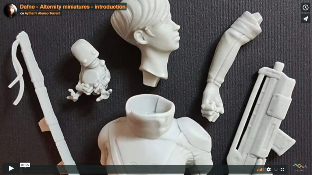 To view the video, login or subscribe
Skin: One hour video full of anatomy study, Experimenting without fears, looking at art with new eyes, achieving a pale skin tone with trial and error, playing with three sources of light with a 2D illustration style effect.
- Skin 1st part
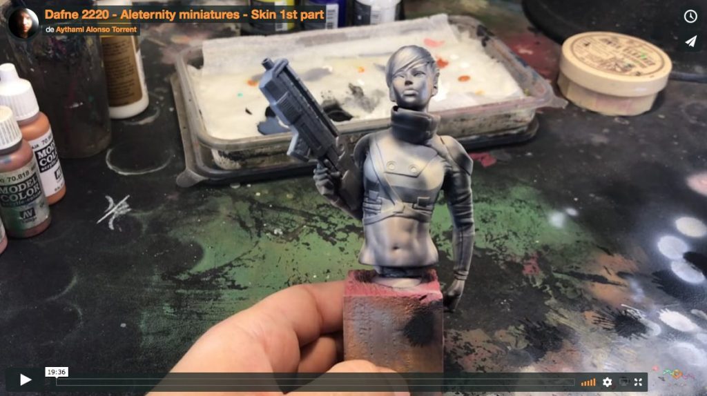 To view the video, login or subscribe
- Skin 2nd part
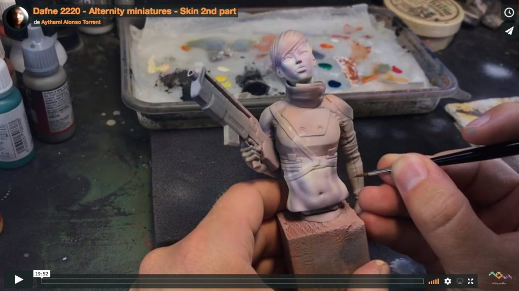 To view the video, login or subscribe
- Skin 3rd part
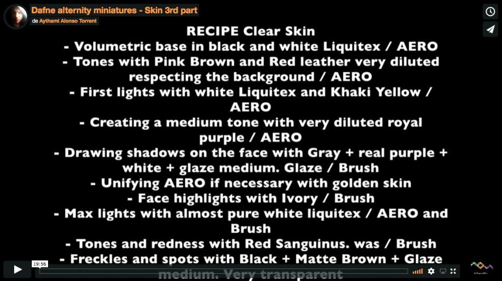 To view the video, login or subscribe
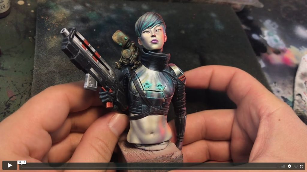
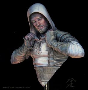
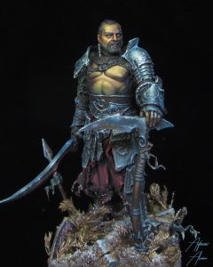
Non Metallic Metal: 1:30 hours were I explain how to observe, translate, correct, experiment, texturize, add tones, just by the hand of the greats works of Kirill Kanaev and Lan Studio. We will know how to paint metal the hard and fun way, not jumping any step. Also I will explain you how to paint light beams, protected shadows and a color map to guide our eyes.
- NMM 1st part
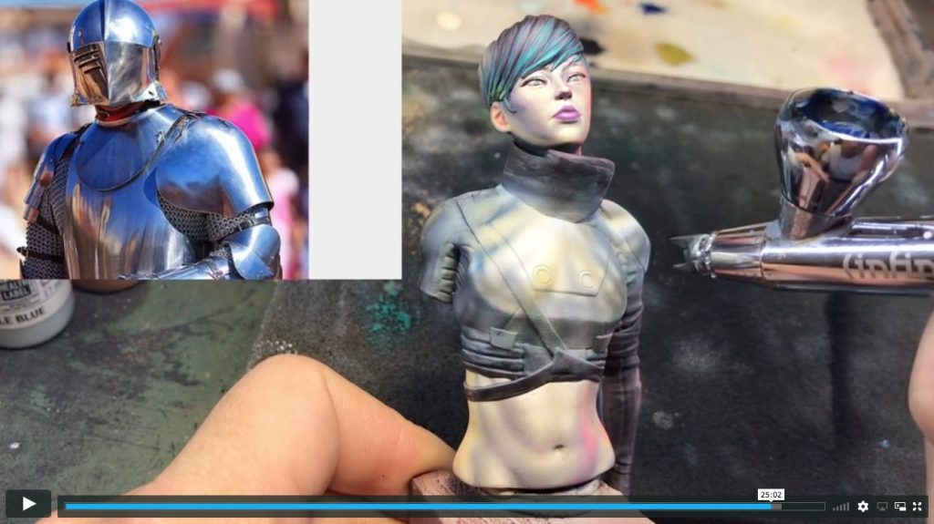 To view the video, login or subscribe
- NMM 2nd part
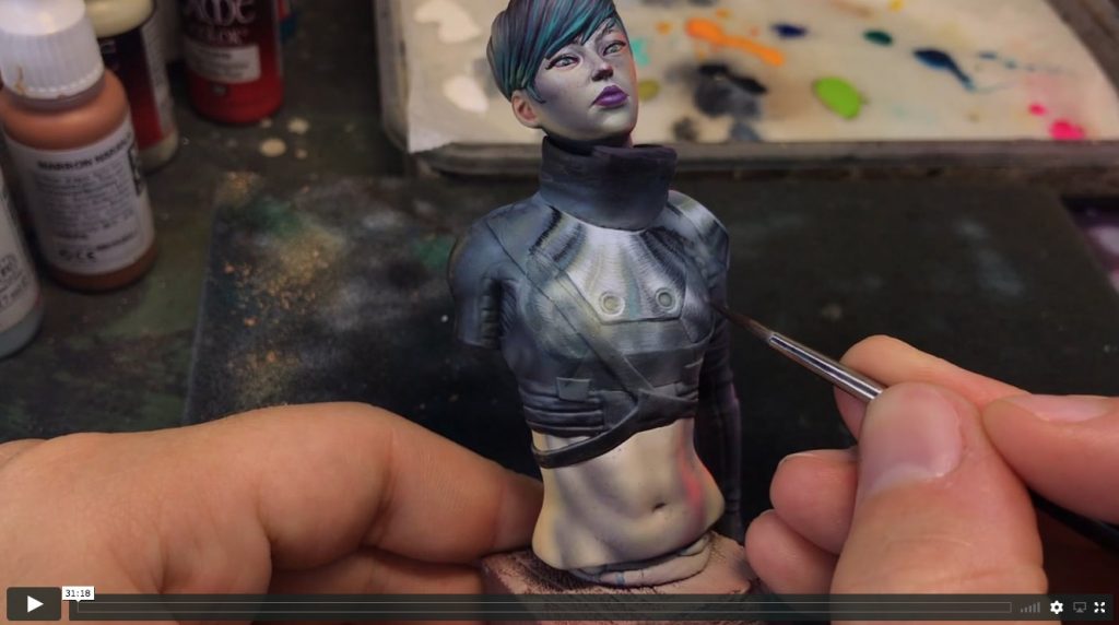 To view the video, login or subscribe
- NMM 3rd part
Disponible Video-tutorials


Excellent video, love how you are not afraid to share your mistakes and you solutions, also how you give credit to other painters for your inspiration. Your painting style makes me nervous, I keep thinking, how is he going to fix that.
Thanks, Matt
Hi Matt! thanks for your words
Im very happy if you can learn the way of freedom painting, facing fears and experimenting. Hope it motivates you to try any idea you have until you got it (or knowing it didn’t work)
Best Regards, Aythami Alonso
Very interesting videos. I am fascinated by how Kirill and Michal produce such realistic NMM. Have you seen the process Michal uses? This blog gives an overview of the steps https://chestnutink.blogspot.com/2018/06/lan-studio-workshop.html It is all done with brush work and some glazes at the end.
Hi Pstockley,
They are true masters! I’ve never seen how they achieve this result and knowing now that is only by brush is amazing.
I considered positioning first the light with airbrush cause for me is much easier to understand and to create light bouncing. I get preliminar shapes into my brain that I didn’t know before. It’s difficult and Krill and Lan are the bests on this.
Hope you continue learning with the videos.
Best regards,
Aythami Alonso
Hi Pstockley,
yesterday I saw your Dafne at the SMC in Eindhoven (NL) at the booth of Alternity Minis. Live it is even more impressive than in the videos. Great job!
Best regards,
Erik
Thanks for your words Erik! I saw the event on photos and seemed incredible. Next year im going for sure. Hope you had an amazing time
Ups, i’m sorry for the wrong adress. I meant, of course, “Hi Aythami”. 😉
Thank you, it was realy a phantasic Weekend!
Gives nice ideas about light reflections and NMM applications, nice tutorial. I think finding ways for fixing mistakes is the right way to learn and to be a better painter.
Very good videos.
Thanks for your words! indeed, is the best way to learn and grow quickly. The more you do so, the less fears and limits you have painting.
Best regards,
Aythami Alonso
Absolutely wonderful! I just started this subscription and first few videos did not dissapoint. I chose your videos as I enjoy your painting, but mostly because you came recommended as you explain a lot of your thoughts, which is, personally, what I learn from the most. Plus, I do teaching myself, so learning how to explain the reasoning we make as painters is especially benefitial. Best wishes, looking forward to watching all other videos. Jakob Villien
Thanks a lot Jakob! Im really happy that you enjoy my way of teaching. I think that transmitting not only technique but thoughts and motivation has the same importance. Theres a lot of hidden information that benefits us that we don’t know. Still learning how to transmit it correctly tho.
Thanks for your words,
Best regards
I love these long videos, they teach so much. Thank you, Aythami <3
Thanks a lot Ken! im glad you like them 🙂
Wonderful, I didn’t realize the part about the hard paint line near the eyes and nose. That open my eyes on making a more realistic facial feature.
I am still confuse a bit on the skin tone, but I will continue experimenting and trying different paint as well.
Im happy you found the tut usefull! There are anatomic areas that when someone points them, youll never forget.
Sometimes painting is a chaos, like i remember with her skin. The important thing is that all makes sense in the end.
Cheers!